From graphicdesignblog.org 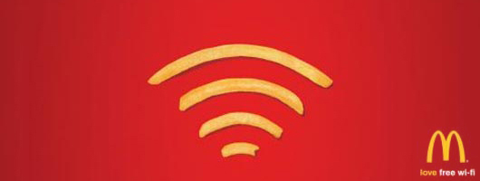 |
| The advertising world is packed with creative ideas and imaginative advertisement messages. The job of an advertiser is to effectively persuade the target audience into buying a certain product or service. Creative ads are the ones that have the power to sell. But there is a vast difference between generating a TV ad and producing a print ad. Print ads are hardest to execute because of the lack of space and freedom. Within a limited domain, you need to effectively place your message to the target audience. Hence, minimalist and conceptual print ads are helpful in serving the cause perfectly. In a print ad, less use of graphic design can yield more substance to the copy. This is where the services of a talented graphic designer come in handy. Following are 30 of the most stunning minimalist print ads that say more with less. |
ATM (Azienda Trasporti Milanesi) |
| The pieces of a puzzle show two people connected with each other, denoting that ATM is ‘connecting the city’. |
 |
McDonalds – Wi-Fries |
| McDonald’s fries are shaped into Wi-Fi sign to show love for free Wi-Fi. |
 |
National Environment Agency Singapore |
| To highlight to Singaporean smokers that from July 1st 2007, smoking inside pubs, clubs and restaurants is prohibited. |
 |
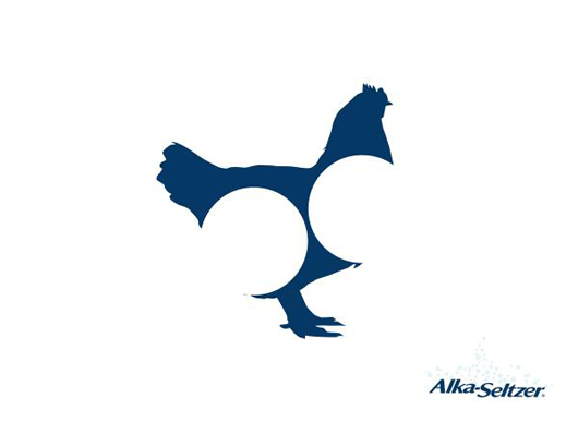
Alka Seltzer: Chicklhouette |
| This minimalist ad of an antiacid medicine shows that the pills can digest a whole chicken. |
 |
MTV Networks: Black Ribbon Michael Jackson |
| Wonderful minimalist ad by MTV, showing a ribbon shaped into Michael Jackson’s legs. |
 |
CNN: Net |
| The spider web in this minimalist ad signifies that ‘No story gets away’ from CNN. |
 |
CARE Austria: Earthquake |
| An earthquake effects more than buildings. The graph shows that it affects average incomes too. |
 |
Columbia: shades |
| The commercial titled shades was done by Prolam Y&R Santiago advertising agency for COLUMBIA (FORUS Company) in Chile |
 |
Albert Dali Naming Consultants: Corn-net-toe |
| For names that make you think. This add creatively spells out the word “Cornetto” |
 |
FedEx: Statue of Sugarloaf |
| This ad shows a brilliantly colored Statue of Liberty with the FedEx purple and orange colors. |
 |
Financial Times: Paratrooper |
| The minimalist ad communicates that “Some tools aren’t a luxury. We live in FINANCIAL TIMES.” |
 |
The Green Ant: Minimalism |
| Minimalism is the art of continually removing things until all you have left is beauty. |
 |
MasterCard Canada: Darkness |
| The darkness ad exhibits the importance of blind people. To them darkness is priceless. |
 |
Hut Weber: Hitler vs. Chaplin |
| The ad tries to communicate that it’s the hat that is different between Charlie Chaplin and Hitler. |
 |
Jeep |
| This minimalist ad creatively shows the face of a dog and a camel merging to make a “JEEP” |
 |
Kapiti |
| Kapiti is a designer Ice-cream that is indicated by the vibrant graphic design created by the melting purse. |
 |
Kit Kat: Bench |
| The bench is made of Kit Kat, signifying that you ‘Have a Break with a Kit Kat’. |
 |
Nestlé Kit Kat: Vuvuzela |
| The ad shows the controversial horn used in FIFA World Cup 2010, communicating ‘Break a vuvuzela, have a Kit Kat’. |
 |
Lego: Tank |
| This minimalist ad communicates that LEGO toys can create real objects. The shadow shows a tank. |
 |
Levis Slim jeans: |
| This minimalist ad communicates that the Levis Jeans just couldn’t get any slimmer. |
 |
McDonald’s road |
| Did somebody say ‘M’? |
 |
McDonald’s: Medium size |
| McDonald’s in Israel changed the menu to much less calories and fat. The M sign denotes the ‘Medium size’. |
 |
Nando’s |
| The ‘Extra Hot peri-peri’ Nando’s is so hot, it can put a hole in a chair. |
 |
Pepperoni Coke |
| Pepperonis are shaped into a Coke bottle on Pizza Hut’s new pizza. |
 |
Pilot pen: Mummy |
| Pilot pen is so water resistant that when written on dinner plates, it won’t wash away. |
 |
Profilo XXL Refrigerator: Lost Vegetables, Tomato |
| The 566 liters XXL refrigerator is so large that vegetables get lost in it. |
 |
Wite-Out spec: |
| The funny resignation letter amendment shows that this correction fluid is ‘For Big Mistakes’. |
 |
The support centers union for victims of assault |
| The use of negative space is this ad creates hand of a criminal (in black) holding the neck of the girl (in white). |
 |
Tzomet Sfarim Bookstore: Faceabook |
| This ad communicates that people should disconnect from Facebook for a while and read a book. |
 |
Volkswagen Snow Tires: Crystal |
| Volkswagen snow tires service have improved grip in winter. |
 |

Monday, January 24, 2011
30 Creative Minimalist Print Ads – Saying more with less!
Sunday, January 9, 2011
Useful Tips for Effective Web Design
Listed below are some useful and rather important tips for designing a professional and high quality web site:
CSS Website Design Guide: Learn how to easily design a professional website using Adobe Fireworks and then build it into a CSS website using Adobe Dreamweaver. Create step-by-step the cool CSS website shown above.
- Neat and Easy Navigation: Navigation of links on your site plays a big role in determining the stickiness of your site (how long your visitor stays and explores your site). Ask yourself this, what do visitors do as soon as they open your site? They would probably read the content of the present page and then look around to find any other page that interests them. Read our article on Web site Navigation Tips.
- Clean Layout Design: A clean layout that uses a lot of white space enhances a site's looks. Try to keep the focus on your content, use dreamweaver templates for this. Use fonts that will be available on all computers to prevent your site looking messed up.
- Program using pure CSS: The world is moving away from table based websites to pure CSS websites because it offers accessibility, reusability and considerably reduces file size apart from giving greater control over the look of your website. The single most important skill you can learn today to become a quality web designer is CSS programming! Even if you are not an expert at CSS you can learn to use the following simple CSS Styles Effects to enhance your website:
- Cool Text Effects using CSS Styles: Text Links Rollover, Text Case Setting, Text Spacing and Line-through Effect
- Bullets in HTML or Deamweaver: Using CSS Styles with bullets (shapes, decimal, roman-numerals, images, etc.)
- Links without Underline: Use CSS Styles to display links without the appearance of the underline.
- Optimum Load Time: Make sure your load time is low. For this you must:
Minimize Graphics, Flash and scripts: They hugely increase your file size.
Optimize your HTML & script code: Make sure that your site doesn't have any unwanted tags or unused scripts.
Use Server Side Include (SSI) files where ever possible. SSI files once called from the web server reside in its cache so on subsequent requests they load faster.
Read our article Tips for a Fast Loading Site for more. - Design for all Screen Resolutions: A site that is easy-to-use always encourages visitors to stay and read your content. For site with long pages of content this is very crucial as the amount of scrolling required is reduced. Suppose your site doesn't look good for a particular resolution it is very probable that the visitor will close the browser window feeling that the web page is not for their viewing. Designing stretch layouts that fit any screen resolution ensures that you know all your visitors see a visually appealing and professional site.
Read our article Designing for all Screen Resolutions for more. - Ensure Web site scalability: Make sure your code and design is scalable. As technology advances and configuration of computers & their monitors keep increasing and varying it is impossible to test your site in all screen sizes and platforms.
- Cross Browser Compatible: Make sure you check your site for Internet Explorer 5+, Mozilla Firefox 1+, Opera 7+, Safari 3+ and Netscape Navigator 6+ as they constitute 95% of the world's browsers.
CSS Website Design Guide: Learn how to easily design a professional website using Adobe Fireworks and then build it into a CSS website using Adobe Dreamweaver. Create step-by-step the cool CSS website shown above.
Adobe Powers Multiscreen Revolution

In the keynote address, Adobe Chief Technology Officer Kevin Lynch will address the market forces driving a new era of multiscreen content authoring, delivery and measurement.
He will highlight how Adobe is helping solve the challenges of delivering multiscreen experiences with both Flash and HTML5 across areas of content creation that include websites, digital publishing, online video, enterprise applications, and gaming.
"The multiscreen revolution is a bigger shift in how people will use computing than we even saw with the personal computer revolution," said Lynch.
"Adobe's strategy is to help developers, creative pros, and entire organizations express themselves across the wide variety of devices that we are all using in our daily lives."
Saturday, January 1, 2011
10 creative shopping bag designs
by Mirko in Advertising, Featured, Inspiration
Shopping bags is an item that pretty much every shop has to use. Strangely, most shops use simple logos or visuals on their bags and very few try to be creative with it. These ten examples should inspire you.
1. Muse

2. Meralco: unplug to save

3. Burn bag

4. Tom of Finland

5. Stop’n grow

6. Gaia

7. ASPE crime stories

8. YKM

9. Red Cross

10. Give me your hand

Monday, December 20, 2010

Thursday, December 2, 2010
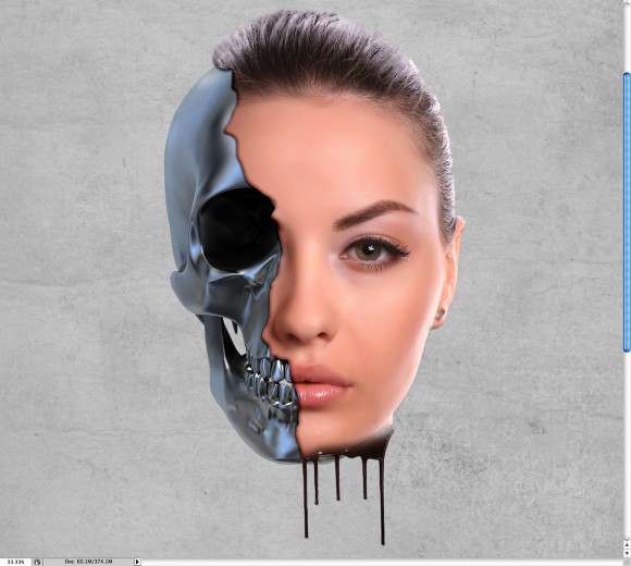
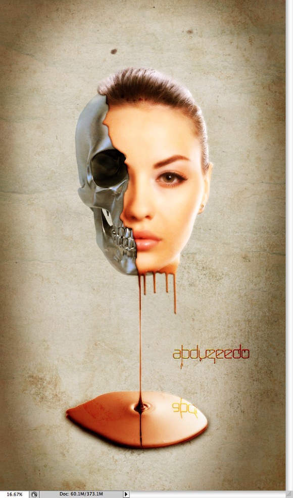
Melting Girl in Photoshop

One of the best things in Photoshop, in my opinion, is that we can create all sorts of effects and photo manipulations mixing regular stock photos. A few weeks ago I used a few images to come up with a sort of surrealist design of a melting girl face over a metal skull. It's still a working in progress, but I decided to share with you how I did it.
So in this tutorial I will show you how you can mix stock photos with blend modes, basic filters and tools to create a really cool design. The whole process is very simple and won't take you more than 1 hour to finish the tutorial.
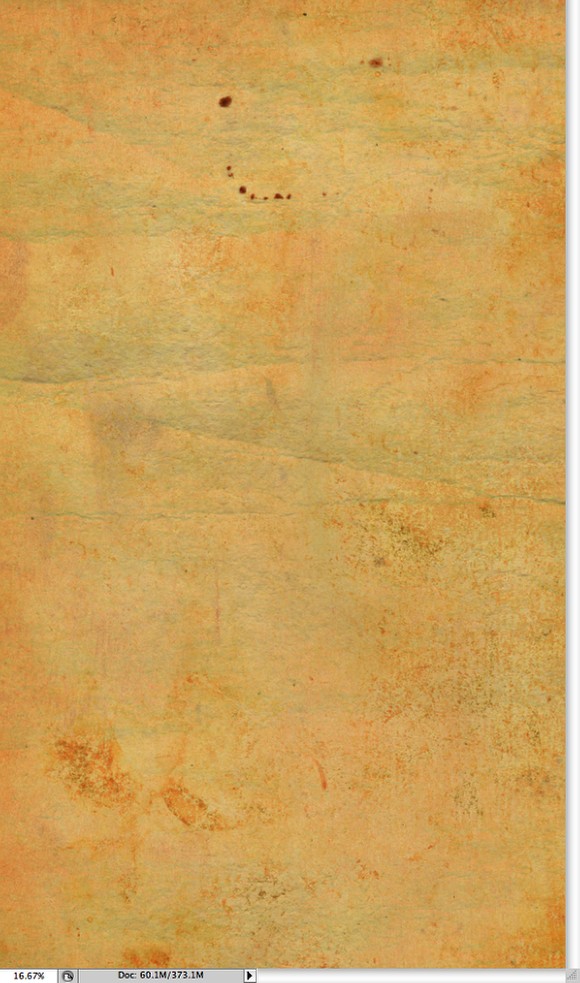
Step 1
Open Photoshop and create a new document, the size I used for my is 3500x6000 pixels. Then import a paper texture into your document. The one I used is courtesy of Shutterstock and you can find it herehttp://www.shutterstock.com/pic-35221027/stock-photo-old-paper.html
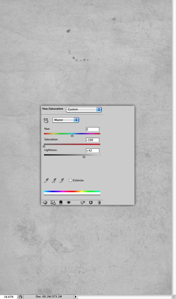
Step 2
Select the paper texture and go to Image>Adjustment>Hue and Saturation. Reduce the Saturation to -100 and increase the Lightness to 42.
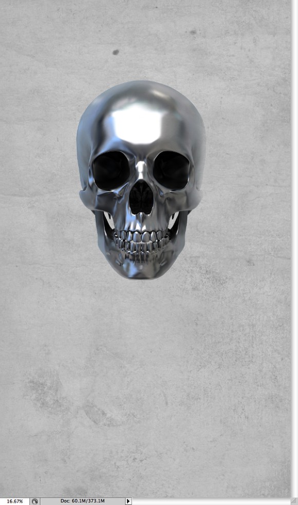
Step 3
Here I used a stock photo of a skull. This one I used is courtesy of Shutterstock and can be downloaded at (http://www.shutterstock.com/pic-12754177/stock-photo--d-render-of-metall...). Extract the skull from the white background and place it in the center of your design.
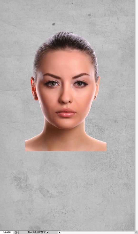
Step 4
Now let's import a photo of a girl, again the image I used was courtesy of Shutterstock and can be downloaded at http://www.shutterstock.com/pic-30450358/stock-photo-attractive-young-wo.... Once again extract the girl from the white background and place it in front of the skull layer.
Step 5
Reduce the opacity of the girl's photo so you can align it. Probably you will have to resize it to match the alignment.
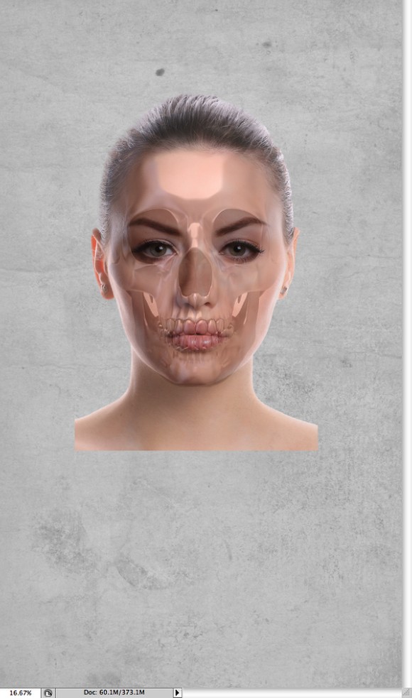
Step 6
With the Lasson Tool (L) select an area of the girl's face to delete. Then go to Layer>Layer Mask>Hide Selection.
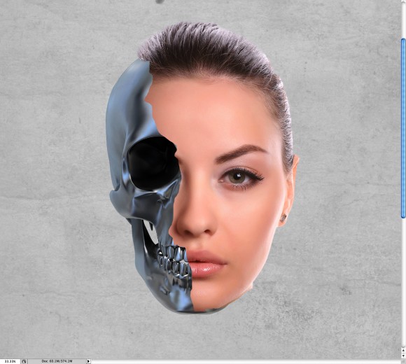
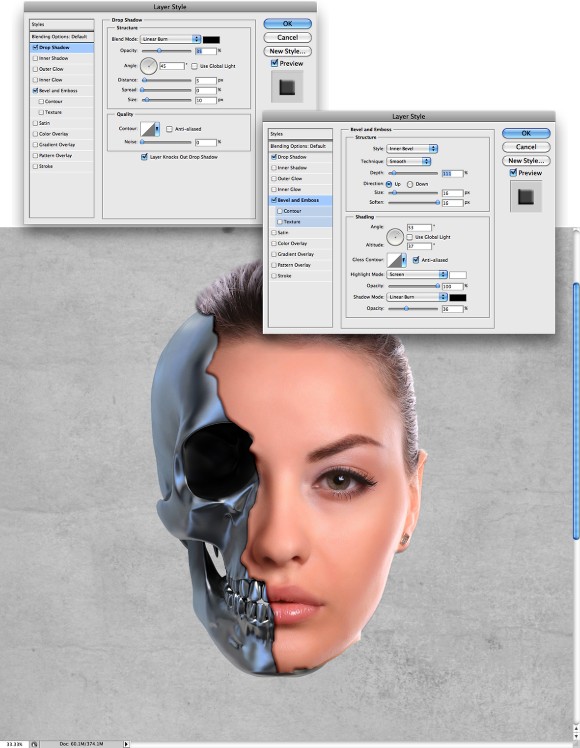
Step 7
Go to Layer>Layer Style>Drop Shadow. Use Linear Burnstrong> for the Blend Mode and black for the color. For the Opacity use 35%, for the Angle use 45º, for the Distance use 5 pixels, 0 for the Spread and 10 pixels for the Size.
After that select Bevel and Emboss. For the Style use Inner Bevel, Smooth for the Technique and 110% for the Depth. For the Direction use Up, 16 pixels for the Size, 15 pixels for the Soften, then for the Shading settings use 53º for the Angle, 37º for the Altitude. For the Highlight Mode use Screen with white for the color and 100% Opacity. Then for the Shadow Mode use Linear Burn with black for the color and 35% for the Opacity.
Step 8
Now I used a photo of a close up chocolate syrup leaking on white background from Shutterstock, you can get it here (http://www.shutterstock.com/pic-46414798/stock-photo-close-up-chocolate-...)
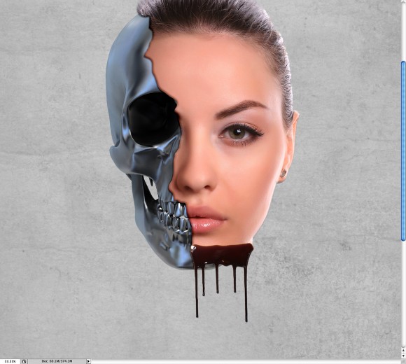
Step 9
Withe the Eraser Tool (E) delete some areas to match the face shape and make the blend well together.
Step 10
Change Blend Mode of the Chocolate Leaking image to Soft Light. The holdingCommand(Mac)/Control(PC) click on the layers thumb in the Layer Palette. You will have a marquee selection of the leaking chocolate.
Select the the girl's layer and click on the layer mask thumb. With the Brush Tool (B) and black for the color start painting the selected area to show the girl's skin that was hidden with the mask. You will have something like the image below.
Step 11
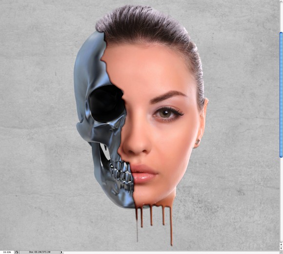
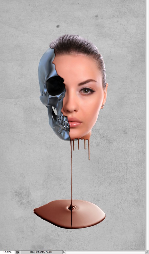
Here I used another stock photo courtesy of Shutterstock, you can get it herehttp://www.shutterstock.com/pic-44487754/stock-photo-melted-chocolate-dr.... The photo is of Melted chocolate dripping on white background and it matched perfectly with the design we're doing, the idea is to make the face sort of melting.
Step 12
Select the face and the dripping layers and duplicate them. After that go to Filter>Blur>Gaussian Blur. Use15 pixels for the radius. After that change the Blend Mode to Overlay.

Step 13
With the Paint Bucket Tool (G) fill the layer with black, then with the Eraser Tool (E) using a very big and soft brush, delete the center of the to create a vignette effect. Group this layer so it will be inside a folder, then change the Blend Mode of the foder to Linear Blur.
Step 14
Place the paper texture again into your document, put this new layer on top of the others and change theBlend Mode to Soft Light.

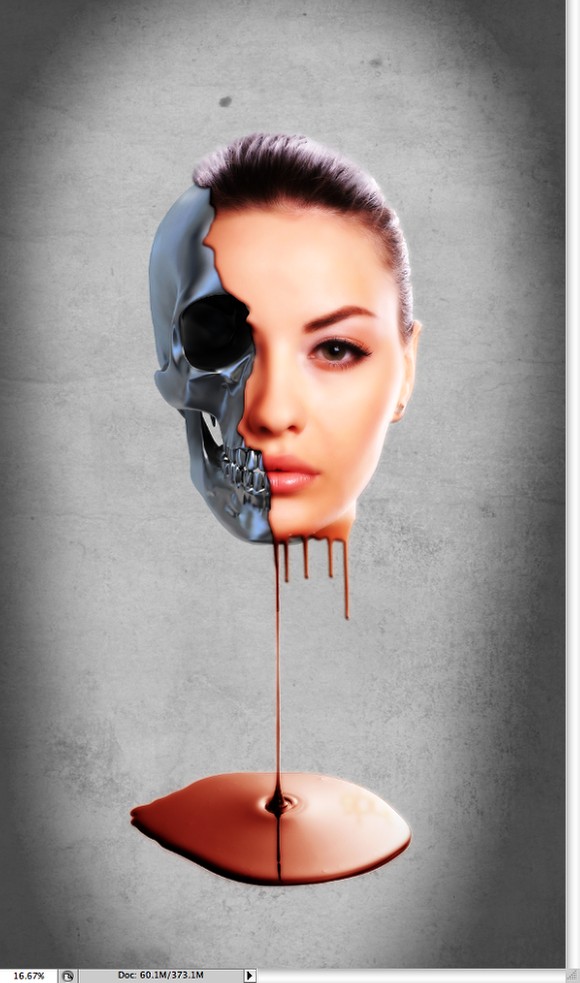
Conclusion
Just add your logo and the composition is done. You can play a little bit more with the shadows to make them more subtle. However the idea of this tutorial was to show you how to create a sort of surreal effect using some stock photos and very basic filters. I hope you enjoyed it.
Subscribe to:
Posts (Atom)