Sunday, March 27, 2011

Obsessed with Facebook Infographic

By Adham Dannaway
Facebook has been around for over 5 years now and during that time we have collected some pretty interesting statistics about who uses it and how it is used. As of 2011 there are over 500 million active Facebook users, which basically means that every man and his dog is using it (I actually know of a few dogs that use Facebook regularly). Online Schools has put together this great infographic which clearly shows just how obsessed we all are with Facebook.
I found it interesting that “facebook, “facebook login” and “facebook.com” were among the top 5 most searched terms in the US in 2010. Did these people forget Facebook’s website address? Another interesting and disturbing fact I discovered is that more than half of us talk to people online more often than we do in real life. Why spend time and effort trying to organise a time to meet up with your friends when you can send them a message online with a click of a mouse?
Looking at these statistics it’s clear that Facebook has become more of a way of life than a website. It will be interesting to see how it grows and develops in the years to come. I’d like to write more in this article but I’m being overcome by a strong urge to check my Facebook. Sorry guys, hope you understand!


Monday, March 14, 2011

8 Valuable Career Advices for Graphic Design Students – Graduation Day!

From www.graphicdesignblog.org

Graduation day is a very crucial day for every graphic design student. It is the point in life where you make the all-important decision regarding you graphic designing careers. Believe me if you’re still about to graduate school, now is the ideal position to start thinking about your future and career prospects.
Having spent nearly a decade in the field of graphic design, I believe it is my duty to impart knowledge and guidance about the practical world to the young and aspiring graphic designers. So today, I would like to give a few career advices for graphic design students that you will want to remember your entire life.
 

1. Continue the Learning Process:

 
Just because you’ve graduated from graphic design school, it doesn’t mean that you should stop learning further. Learning is a continuous process that should be pursued by every human being from cradle to grave. Don’t let your skills stagnate by saying no to further learning. Don’t limit yourself to one specific skill set, be a jack of all trades. The more multi-talented you will be, the more openings you will get of acquiring a job. Constantly update yourself with the latest tricks and techniques in graphic designing so that you don’t lag behind.
 

2. Theory is easy, Practice is NOT:

The first thing that I learnt from my experience as a graphic designer is that whatever you learn in textbooks don’t always apply in real life. This is because talent is more essential than degree in graphic designing. When stepping out from the school life to the practical life, you must learn to differentiate between theory and practice. Now I don’t mean to discourage the concept of reading textbooks and course material. You may learn the essence of graphic designing from school but when you enter the practical field among creative veterans, the whole scenario changes.
 

3. Don’t stop Socializing:

Many students who are graduating from design school hold a perception that after stepping into the professional world, they will not be able to hang out with their friend circle. Well…they couldn’t have been more wrong. This is because networking and social media for graphic designers is extremely imperative. Maintain your contacts with colleagues, seniors and teachers all along your professional life. Frequently visit graphic design related seminars and build contacts with creative veterans over there.
 

4. Build a Graphic Design Portfolio:

A pre-requisite for becoming a graphic designer is to assemble and build your personal graphic design portfolio. It serves as your identity and displays your creative potential to the world. Now of course you must be thinking…being a graphic design student with no work experience, what will I show in my portfolio. No worries, you can start off by displaying your assignments and class projects in your portfolio. With the progress of time, you can update some real work as well.
 

5. Polish your Core Skills:

Although I just mentioned that one should be the jack of all trades, but I personally believe in being “Jack of all trades and master of one.” While acquiring the know-how about several aspects of graphic designing, remember to polish your core skills in order to make them prominent. For example, if you have a desire for becoming a web designer, cultivate your CSS, HTML and other web developing skills.
 

6. Gain Experience as an Internee:

While this piece of advice isn’t compulsory in becoming graphic designers, it certainly helps boost your credentials for future career. Interning at a design related firm is a pre-requisite at every graphic design school so that shouldn’t be a problem for most students. But for students who think that evading the internship program is better…think again. Internship gives you a great chance to experience the ‘real’ world and learn from the adept and experienced people in the professional field.
 

7. Never Lose Faith in your Abilities:

Take it as an advice or simply motivational words, but never lose faith in what your abilities as a graphic designer. You will encounter scores of people who criticize just for the sake of it. When you enter into the professional world, you are surrounded by people who are more experienced than you. Don’t get discouraged that you don’t know much and be confident in whatever you know. Satisfaction for graphic designers is the key to success.
 

8. Make your Personality Attractive:

Rugged jeans, a pimped shirt and fuzzy hair, probably coupled with a pierced ear…this is the general perception of a graphic designer’s appearance. However, my advice isn’t for graphic design students to be like that. I believe that appearances are only skin deep, your real personality is deep within. Develop your personality into an interesting and appealing one, the kind that people will find hard to resist. Update yourself with the latest news and trends on things besides graphic designing as well. This way when you converse with people, they won’t take you for a design geek.

Friday, February 18, 2011

What factors determine a graphic designer’s salary?

www.graphicdesignblog.org

How much to charge clients is every  graphic designers concern. You charge excessively, they might not hire you. You bill them under-par, they might consider you as a cheap designer. For this reason, the perfect fee range should be determined beforehand.
There comes in every graphic designer’s mind a question…Are we truly valued and paid? This query ensue a series of questions like ‘How much a graphic designer should be paid?’ and ’On what criteria should he be paid?’ Although I have always advocated that the graphic design field is for the sheer pleasure and obsession of it. But then again, an individual has to make ends meet as well.


Factors that determine a graphic designer’s fee:

1) Experience and Creativity:

The first thing that clients see in a graphic designer is the level of experience he possesses in his particular field of work. Many corporate clients avoid hiring amateurs to do their graphic design projects. But clients with a low resource base also hire graphic designers with little experience and exposure. The magnitude of experience and the level of creativity of graphic designers really speak volumes for the money they charge.


2) Size of the Project:

Another important factor that evaluates your remuneration is the size and magnitude of the graphic design project. The type, scale and magnitude of the assignment you are working on are essential in determining how much you should be charging. Since, for graphic designers, time is money. Although there are some clients who value money over quality, a graphic designer should never compromise on his quality of work.


3) Area and location you work in:

The area, region and place you are working count a lot in determining how much you can charge your clients. Just to give you a rough idea of how graphic designer salaries fluctuate from state to state and within city, the designer working in Los Angeles CA is likely to earn dissimilar to a designer working in Detroit MI. Graphic Design Salary Calculator, where salary data is taken from the Occupational Employment Statistics (OES) Survey Program. This is because client’s ability to pay varies from state to state.


4) Fixed or Flexible charges:

Another aspect of charging a client is whether you will be charging a fixed fee or charging on an hourly basis? This is usually imperative when you are deciding whether to work part-time or full-time. Normally graphic designers working part-time charge on an hourly basis since they do not have any fixed working timings. On the other extreme, full-time graphic designers who work 9-5 generally charge a fixed remuneration.

5)Miscellaneous expenditures incurred:

Apart from the standard expenditure and costs of a graphic design project, there are certain variable overhead expenditures incurred as well. For example the printing costs that incur when the client asks for numerous reruns of the design project. Then there is the travelling cost for clients who are reluctant to visit the designer and insist on calling them over. Hence a designer has to keep all variable expenditures in consideration before charging their clients.

Being a graphic designer, do you think you are getting what you are worth?

Monday, February 7, 2011

20 Bad Habits of New Bloggers

From www.instantshift.com

As bloggers, we face a wide variety of tasks each day related to managing and building our blogs. Productivity and efficiency are vital, especially for part-time bloggers. A number of extremely addictive and time-consuming habits stand in the way, though.
I’m sure you can relate. We all make mistakes, but learning from them and not repeating them will make you successful in every respect. The key is to control habits, good and bad. If you know how to change your habits, then minor effort can create major results.
For a better blog, a variety of factors must be taken into consideration. In this article, we’ll cover some of the most notable habits to avoid for better blogging.


Bad Habits of New Bloggers


01. Don’t Blog in a Niche You Don’t Like

New bloggers read the success stories of others and start following them and writing about similar topics—but they don’t see how much work goes into those blogs. Bloggers don’t do well just by writing one post every now and again, and continuing to write about something you’re not passionate about is difficult.
Keep your interests in mind when you select your subject. Know your subject; don’t write about what you don’t know. Establish yourself as an authority.

02. Don’t Obsess Over the Subscriber Count

The most common measuring stick for determining a blog’s impact, importance or success is the number of subscribers.
While building a large base of subscribers is important for any blog, obsessing over the subscription count does more harm than good. For one thing, you can’t force anyone to subscribe; you don’t control the situation, as frustrating as that may be. Secondly, loyal and engaged subscribers are more valuable than subscribers who never read your posts. Getting a clear picture of an audience and its participation by looking only at the subscriber count is impossible.
Focus on finding active readers and developing relationships with them, instead of on the length of your subscriber list.

03. Don’t Check Stats Constantly


Traffic statistics can become addictive; it’s easy to slip into the habit of compulsively checking your referral stats, search engine traffic and page popularity rankings. Checking your stats every couple of hours won’t change the results.
Make a schedule; check your stats once a day or once a week and not at any other time. You could allot an extra hour once a month for more in-depth analysis; this will give you a broad perspective on daily traffic and SEO.

04. Don’t Chase Social Media Traffic

Social media brings traffic to a blog, but it can be a huge distraction. Too much social media involvement could take you away from the task of generating content. Remember that content is king; it is responsible for drawing traffic. And make sure to submit only your best work to social media. You’ll see more success.

05. Don’t Be a Social Networking Addict


Most of us are addicted to our social networks. Keep your Facebook, Orkut, Twitter and other tabs closed while working. Switch off all instant messengers and connect only when necessary. Concentrate. Setting a dedicated blogging time helps.

06. Don’t Over-Indulge on Feeds and Forums

Web forums and RSS feeds are great ways to stay updated, so subscribe to feeds for blogs about your subject. Many people spend a lot of time every day wading through feeds that don’t interest them. Go through your subscriptions every couple of months and get rid of anything you read infrequently; don’t let a subscription waste your time every day.
Similarly, web forums are great for networking and helping others but if you’re not careful, you could spend much more time participating than you intended. Forums can become addictive, especially if you get email notifications whenever people reply to your posts. Stick to a schedule for forums as well. Opt to get email notifications only for important threads, and unsubscribe as soon as you’ve received satisfactory responses to your questions.

07. Don’t Be a Disorganized Communicator


Communicating with other bloggers is an important part of blogging, but many people find that they’re spending an increasing amount of time on it.
Staying organized will reduce time spent on email. Categorize the types of emails you receive often and make response templates for them, or set up a detailed FAQ page. Manage your inbox more efficiently by using folders. Check your emails just twice a day. Learn to work with your mail program or inbox window closed. You don’t have to respond to every single email you receive.

08. Don’t Skip Proofreading


Proofreading might sound dull, but it is mandatory. You might be able to get away with an error here or there, but a load of mistakes in every post will distract the audience.
If English isn’t your first language and you’re writing for an English audience, be diligent about making your point.
Edit and proofread after writing. If you are both the writer and proofreader, leave a gap of at least an hour between writing and proofreading. Make a copy of the original version, and check the spelling and grammar in it.

09. Don’t Neglect Design

Many bloggers underestimate the importance of design. Every first-time visitor observes the overall look and feel of a blog. Three or four sidebars full of useless widgets, for example, will just confuse visitors. Visitors will stay for a while if they feel comfortable in an easy-to-use design.
Sensible color combinations are another important factor in a successful blog. For example, a bright and flashy interface for a business and marketing blog would seem unprofessional and irrelevant. Also, the fewer image files you add, the faster the page will load. This matters for SEO—and to your visitors.

10. Don’t Tolerate Plagiarism


You’re free to visit your favorite blogs, read articles and even draw inspiration from them, but don’t copy. You’ll have to be original if you want to be known.
People who want to be full-time bloggers need to remember that copying and pasting random articles into a blog doesn’t cut it; you won’t gain recognition among readers or be successful by plagiarizing—or by habitually reposting.
Do thorough research to produce high-quality, unique content. A successful blogger has a unique voice and unique style.

11. Don’t Be Goal-Less

When bloggers fail, it’s often because they didn’t set out with a clear goal. Setting realistic goals is highly beneficial because they make great motivators. Whether the goal is to get a certain number of subscribers, comments, ads or anything else, having a goal keeps you from getting lost in a sea of endless tasks.

12. Don’t Write About Whatever

Every blogger has a personal life, a life away from the blog, and that’s not a bad thing. A business blog is not a diary, and it should be concise. Remember that readers stay away from things that don’t interest them. When it comes to writing about your personal life, know when and where to draw the line.

13. Don’t Just Share News

If traffic to your blog is substantial and steady, then you can post breaking news knowing it will get good exposure. If you don’t have heavy traffic and you focus on news stories, then you might lose visitors, because you’ll be in direct competition with giant blogs such as TechCrunch, Mashable and ReadWriteWeb. Several major blogs do this work properly and efficiently. Distinguish your blog from others by going a different route.

14. Don’t Spam

Don’t spread links to your blog everywhere you go, and don’t try to be the first commentator in every post on a traffic-heavy blog. Also, avoid replying to every comment on your own blog.

15. Don’t Put Ads Everywhere


Some bloggers make the mistake of thinking that they can put ads everywhere on the blog and double their profit. What they don’t realize is that this will affect their SEO and revenue. Too many ads will irritate readers and drive them away.
Don’t waste time trying to convince readers to buy products by peppering your posts with sneaky words. They’ll move right on. Minimize affiliate marketing and readers will stick with you.

16. Don’t Blog Without a Domain Name

Most new bloggers start their careers on a free domain (such as Blogger or WordPress)—but there are no free lunches. With a free domain you’ll never have complete control over your blog. I recommend that new bloggers set themselves up on their own domain from the beginning.

17. Don’t Post Irregularly


The key to success is regular and consistent posting. Many bloggers write every day at the beginning but after some time become irregular. Readers don’t have any idea what to expect or when. Make a master plan and a schedule, and post regularly!

18. Don’t Give Up Early On

Patience is crucial. Everybody wants to earn quick money online, and some think they can get rich overnight. Every aspiring blogger should remember that blogging is not as easy as it appears. It takes hard work and patience, and overnight success is rare. Don’t give up early.

19. Don’t Keep the AdSense Notifier On


There’s a cool Firefox plug-in that refreshes AdSense stats every 15 minutes. Revenue boosts morale and motivation, and poor earning days dampen enthusiasm. Turn off your real-time revenue notifiers, and check revenue just once per day. You’ll have peace of mind and you’ll be able to concentrate on writing.

20. Don’t Let Ideas Slip Away

Ideas come and go quickly, so write them down somewhere instead of relying on memory. Prepare drafts for current and future posts; keep the waters flowing.

Conclusion

I wonder what makes people think that blogging is an unskilled profession. I say, don’t knock it till you try it. And I’ve done my bit by posting this article.

Thursday, February 3, 2011

10 Corporate Brand Logo Evolution

From www.instantshift.com

Have you ever wonder how the first Apple logo looks in 30 years back? Did you know Volkswagen was Hitler’s idea? Or how the IBM logo changes over the time? Or where the Mercedes-Benz Brand And The Three-Pointed Star logo came from?
As we already know that Logo is the identities that are fundamental to building a brand and communicating with the target audience. Many well-known corporate brand changes their logo to archive the perfect identification because identity’s creation is not an occasional activity, but a permanent one.
Below we listed 20 Corporate Brand Logo Evolution with their fascinating stories linked to their current official site.
Let’s take a look at the Interesting stories behind the logos of some of the most popular brands in the world. Be sure to let us know if I have missed anything!

Corporate Brand Logo Evolution


01. Apple
It is one of the biggest consumer electronics and Software Company, best known for products like Macintosh, iPod and iphone. Steve Jobs, Steve Wozniak, and Ronald Wayne had together setup Apple in 1976, to sell their hand-built computer Apple I. They had offered their product to HP first but were declined by them. I think HP would still be regretting this today.
The road to success wasn’t easy for Apple, and Wayne liquidated his share in the company for a mere $ 800. After the launch of Apple II in 1977, things started to look up for Apple and we all know what heights the company has reached since then.
Apple II was successful mainly because it had colored graphics. Great and simple design, has always been the USP (Unique Selling Proposition) for Apple, and their logo is no exception. When Apple was started, the logo was a complicated picture of Isaac Newton sitting under a tree. This had been designed by Jobs and Wayne, with the inscription: “Newton … A Mind Forever Voyaging Through Strange Seas of Thought … Alone.” Frankly, I don’t think it was just a coincidence that Apple had slow sales during this period.
However, Steve Jobs hired Rob Janoff to simplify the logo, which turned out to be a great idea. Rob created the ‘Rainbow Apple’ which was the logo for company till 1998. There are many rumors as to why Rob had chosen to create such a logo. One of them says that the Apple was a tribute to Newton (discovery of gravity from an Apple), and since the USP for Apple at that time was colored graphics, it had the rainbow colors. Another explanation exists that the bitten apple pays homage to the Mathematician Alan Turing, who committed suicide by eating an apple he had laced with cyanide. Turing is regarded as the father of computers. The rainbow colors of the logo are rumored to be a reference to the rainbow flag, as homage to Turing’s homosexuality.
Janoff, however, said in an interview that though he was mindful of the “byte/bite” pun (Apple’s slogan back then: “Byte into an Apple”), he designed the logo as such to “prevent the apple from looking like a cherry tomato.”
When Apple launched the new iMac in 1998, they changed their logo to a monochromatic apple logo, almost identical to the rainbow logo. Now, the Apple logo comes with nice gradient chrome silver design. It is one of the most recognized brand symbols in the world today, and the shape is what identifies the company more than the color.

02. Shell


Back in 1900, when the company was started the logo was a realistic and simple shell which lies flat on the ground. This was a pectin or scallop shell, but today the company has a logo which is bold, colorful and much more simplistic.
The evolution of the logo began after 1915, when rendering enabled the company to reproduce its identity easily. This is visible in the 1930 logo for the company. When the company started a project in California, it added the red and yellow colors to the symbol. The colors help Shell to stand out. Additionally, these are the colors of Spain, where many Californian settlers were born, which might have helped the company to create an emotional bond with the people.
With the advent of internet and fax machines over the later years, it became necessary for the company to simplify their logo, which would prevent it from being distorted in small images. The 1971 logo designed by Raymond Loewy is very simple as compared to the earlier logos.
This has helped the company because this logo is more memorable and recognizable, accountable to the simplicity of the logo. The 1971 logo is still used by the company albeit with minor changes, but it has become so recognizable that it often appears without the company name now.

03. Xerox
The Xerox Company used to be known as the Haloid Company almost 100 years ago. But in 1938, Chester Carlson invented a technique called xerography which we today call the photocopy technique. Unfortunately no one was willing to invest in his invention, and many big giants like IBM, GE, RCA and others decided not to finance this invention.
But Haloid Company decided to go with Chester and made the first photocopying machine named Haloid Xerox 14. As can be seen in their logos, the original Haloid word which was prominent in the company’s logo before 1961 was completely replaced by Xerox due to the immense success of this idea.
They retained almost the same logo from 1961 to 2004. But in 2004 there was a problem with the Xerox books and it tried to reinvent itself with a new logo. People associate the company only with photocopy machines, and that has been a major problem for Xerox.
The company changed its logo in 2008 to get away from this stereotyped image, by changing the font of the word. They also added a ball which has a stylish X instead of their ‘boring’ X in earlier times According to Anne M. Mulcahy, Xerox’s chief, that little piece of art represents the connection to customers, partners, industry and innovation.

04. BMW
BMW or Bayerische Motoren Werke AG (Bavarian Motor Works) was originally founded as an aircraft company. The aircrafts manufactured were painted with the colors of the Bavarian flag, which is the color of BMW logo. Another explanation is that when the pilot used to sit in the plane he would see alternating segments of white and blue due to rotation the plane propeller (blue being the sky).
The major business of BMW was to supply planes to the German army during World War I. But after the war they were forced to change their business. It made railway brakes, before making motorized bicycle, motorcycles and cars.
The logo itself hasn’t changed a lot during the years, but now has a more stylish look due to the different gradients. The unchanged logo has made it easier for people to remember and has given the company more recognition.

 05. Nike
Nike probably got the best deal amongst all companies when Caroline Davidson designed its logo for just $35 in 1971. The main part of the logo hasn’t really changed with time. However, I don’t understand why they waited for 7 years before they realized that the text and the swoosh were overlapping each other.
As the brand gained recognition, the company name was dropped from the logo, which made it more simplistic and memorable. The company has different variations of this logo for its various departments like Skate, Soccer etc.

06. IBM

As you would observe from the logos above that IBM was earlier known as The International Time Recording Company (ITR), whose major products were mechanical time recorders, invented and patented by Willard L. Bundy in 1888. So in the earlier periods the logo of the company had ITR inscribed on it. Later in 1911, ITR was merged with the Computing-Tabulating-Recording Company, which is why you will see that both ITR and CTR are there in the 1911 logo.
In 1924, the Computing-Tabulating-Recording Company adapted the name International Business Machines Corporation. The ornate, rococo letters that formed the “CTR” logo were replaced by the words “Business Machines” in more contemporary sans-sarif type, and in a form intended to suggest a globe, girdled by the word “International.”
In 1947, IBM decided to drop the globe from its logo, which was by then quite familiar amongst the people. The logo was not the only change in 1947; it was accompanied by a change in business from the punched-card tabulating business to computers. The typeface of this logo was called Beton Bold.
In 1956, before Thomas J. Watson, Sr died he appointed Tom Watson, Jr. as the CEO. Tom Watson, Jr. decided to project the beginning of a new era in the company, for that he changed the company’s logo as well as the actions. Paul Rand designed the new logo which represented that the changes in the company would be subtle and will not disrupt the continuity. Also, the new logo looked more solid, grounded and balanced.
Another change in the logo was designed by Paul Rand which had stripes instead of the solid font. It depicted ‘speed and dynamism’. Since, then the logo has more or less remained the same, and the design has been recognized and replicated all over the world.

07. Canon


The company had always wanted a global perspective, and the logos reflected the same as early as 1934. A specialized advertising designer had created the logo which included typeface never seen before in Europe or North America.
The first camera launched by the company in 1934, was named as Kwanon, after the Buddhist goddess of mercy. The logo included the wordings and a picture of the goddess with 1000 arms and flames.
As the years went by, like all other logos we have seen above, the company strived to make the logo as simple and memorable as possible. The logo had only been trademarked in 1935, and after that a lot of designing work went into making the logo more balanced. After 1956, the logo hasn’t been changed, but the designing effort is clearly visible in their simple but classic logo.

08. Google

The clarity of thought is visible in the company’s logo right from the very beginning, when in 1996 two Stanford University computer science graduate students Larry Page and Sergey Brin built the search engine.
The name of the search engine is derived from Googol (meaning one followed by 100 zeros). Google’s first logo was created by Sergey Brin, after he taught himself to use the free graphic software GIMP. Later, an exclamation mark mimicking the Yahoo! logo was added. In 1999, Stanford’s Consultant Art Professor Ruth Kedar designed the Google logo that the company uses today.

09. Kodak

Interestingly, Kodak was the first company to integrate its name and looks into one symbol in 1907. After 1935, Kodak predominantly used yellow and red colors and the complete name of the company. First time the Kodak name was completely written in the logo in 1935, which began the use of yellow and red colors as well.
In 1960, they tried to show a flip page as a logo, but was changed to a box and graphic “K” element in 1971. I think the logo in 1971 was quite trendy, but it might have been a little complex. Retaining the 1971 concept, there was a slight variation in the font in 1987. The new font looked contemporary.
Again, like other companies, Kodak decided to simplify their logo in 1996, and removed the boxes. The red color gives a more brighter and structured feel of the company. In 2006, again a slight variation was made in the logo with a rounded ‘a’ and ‘d’, to give a contemporary look.

10. Microsoft


The Microsoft story began in 1975, when Bill Gates and his friend Paul Allen coded the first computer language for a PC and named it BASIC. Soon they named their partnership as Micro-Soft which explains the first logo of the company.
They changed the logo in that year itself and dropped the hyphen too. For the next 12 years, the logo had a distinctive O. The employees called this as “Blibbet”. It is said that at that time, the Microsoft cafeteria even had a double cheeseburger named “”Blibbet Burger”.
When a new logo came on in 1987, there was a campaign within the company to “Save the Blibbet”. But, this couldn’t stop the company from adopting a new logo. The logo designed by Scott Baker, came to be known as “the Pacman logo” due to the distinctive cut in the O.
In 1994, they integrated their tagline ‘Where do you want to go today?’ within the logo. This was widely mocked and the company kept trying different taglines like People Ready, Start Something, Making it Easier etc.
The new 2008 logo has all the text in Italics (including the tagline), but the look of the logo has remained pretty much the same. Basically, the company is so well renowned already, that I don’t think the logo needs to change, since people already recognize and connect with it worldwide.

Tuesday, January 25, 2011

8 Famous Brands and their Rebranding Cost!

From graphicdesignblog.org


We all know giant multinationals and famous brands invest heavily in their brand identity design. But most of the time costs incurred are kept a secret. Bear in mind that a rebranding cost is entirely different from the cost of a logo redesign. A complete rebranding includes changes to the logo design, package design, marketing campaigns and the cost incurred to expose the rebranding into the market.
As graphic designers, we ought to know how much do famous companies and brands spend on their brand identity design. When a company posts an outrageous figure for its corporate rebranding, people tend to become judgmental over the ridiculous price incurred. But branding is not all about designing a logo, there are other aspects of the branding process that need to be fulfilled in order to deliver a revamped identity. In the field of graphic design, there are various tools that complete the branding process.
  • The logo and stationary design
  • Package and label design
  • Website Design
  • Designing the marketing campaign (Advertising, Billboards, Flyers, Girt Items)
Following are the branding costs of 8 famous brands that were rebranded at a fairly excessive cost.


Pepsi

Anz

OCG logo
LiverPool logo

BP Helios

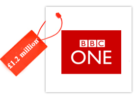
BBC One

OCG logo
LiverPool logo

Accenture

TranLink

OCG logo
LiverPool logo

Starz

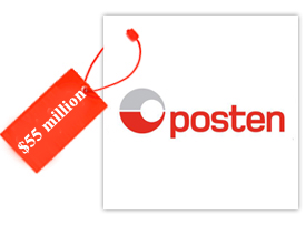
Posten

OCG logo
LiverPool logo

Some Exorbitant Logo Prices:

Below are some of the prices of only logo designs that are outrageously lofty:
Designer: Wolff OllinsDesigner: L.N AgencyDesigner: L. AssociatesDesigner: -
Logo Price: £400,000Logo Price: £400,000Logo Price: $240,000Logo Price: £1.020.00
Do you think that such exorbitant prices are acceptable for a rebranding?